Louise Lawler: “distorted for the times”
What isn’t distorted?
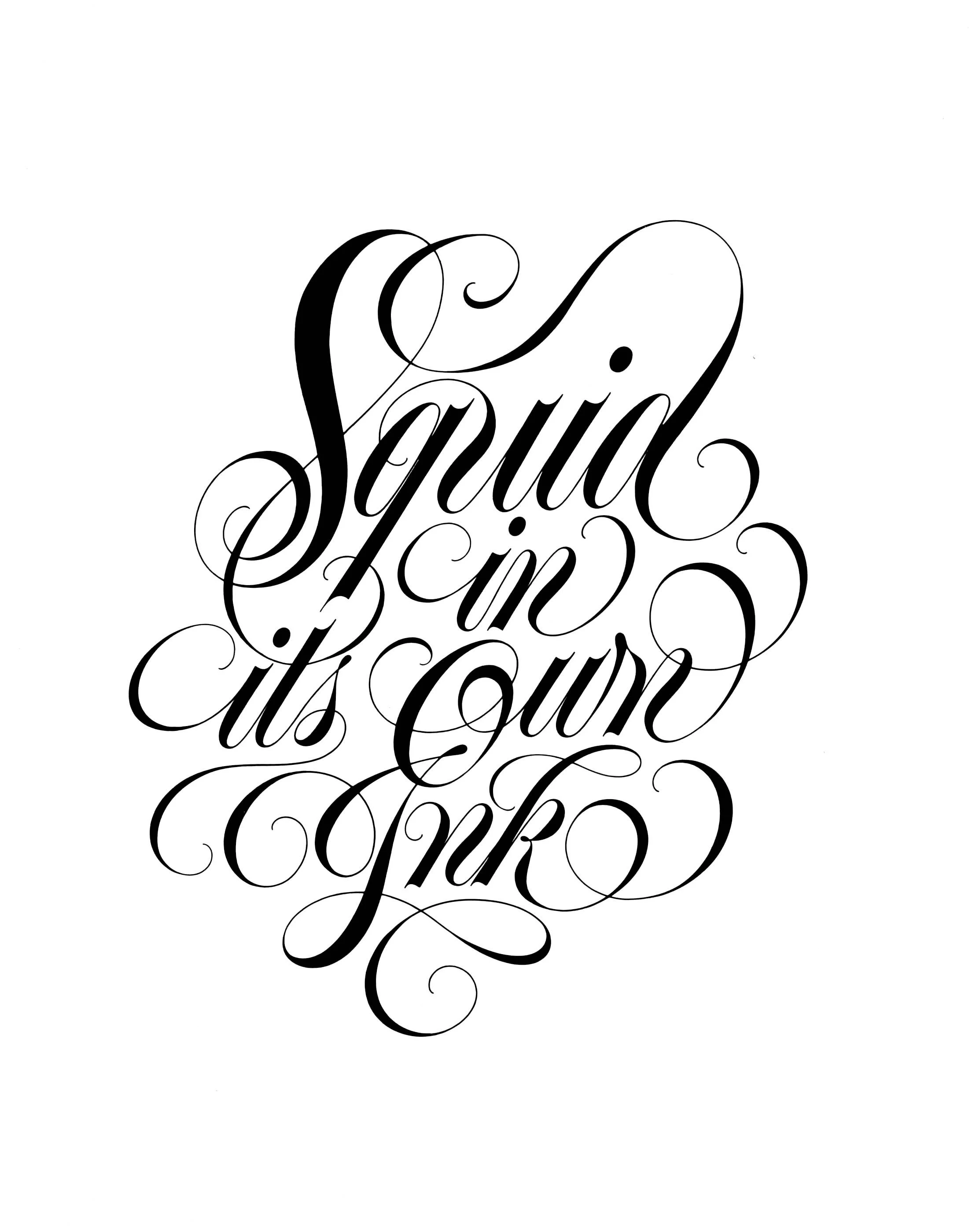
(A squid in her own ink.)
Louise Lawler has been distorting art from the beginning.
Capturing art objects in a kaleidoscope of their own circulation, Lawler’s image-making is vested in the ways not only art but meaning itself can be produced and manipulated by its own presentation. What we see, think and know about a work of art (or anything for that matter) is made, and re-made, in relation to its surrounding context and modes of delivery.

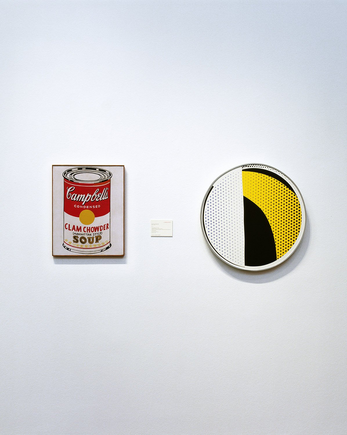
Left: I-O, 1993/1998. Louise Lawler. Silver dye bleach print on museum box. 19 15/16 x 23 3/8 inches.
Right: Soup and Mirror, 2001/2005. Louise Lawler. Silver dye bleach print on museum box. 19 3/4 x 15 3/4 inches.
Courtesy the artist and Sprüth Magers
Lawler’s works capture art in various environments, giving the viewer “access” to its public and private spaces, handling and off-hours. This access is, however, mediated. While Lawler does not directly intervene in the spaces she photographs, her wry and sharp approach to image selection, cropping, scale, titles and methods of presentation produce a mediating frame through which our gaze is shaped and manipulated. This mediation is handled with a level of ambivalence; ricocheting between the transparent and oblique and the explicitly announced.
Put simply, it is one thing to look at a picture but it is another thing to look at a picture that is reminding you that you are looking at a picture.
A rather straight-forward photograph of a Lucio Fontana installed above an exotic skin rug becomes a different kind of punch line when the Fontana above an exotic skin rug is further underscored by a delicate (and slightly exotic) dingbat printed on the photograph’s mat and the notorious commanding red of a Fontana is deployed to color the image’s frame. If slashes and holes became the signature marks of Fontana’s Spatialist paintings, these sleight of hand moves in the presenting modes of images are a signature mark of Lawler.
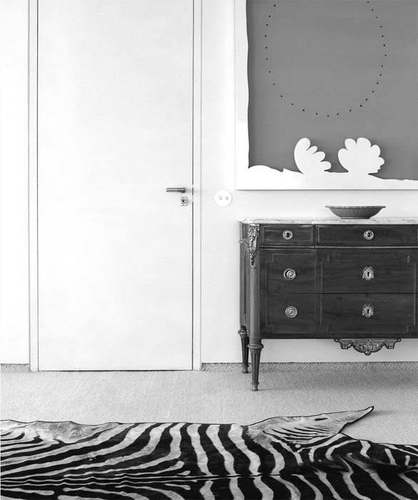

Skin from Angola, bought in Portugal, 2001/2010. Louise Lawler. Gelatin silver print with printed mat in artist frame.
5 x 4 1/2 inches (image size)
14 1/4 x 11 1/2 inches (frame size)
Courtesy the artist and Sprüth Magers
While a self-reflexive awareness is ever-present in Lawler’s work, recent approaches have turned an eye to the presenting modes of images not in the artist’s control. In her “adjusted to fit” works (beginning in 2010), Lawler creates a body of works which offer her own images to be contorted by their very presentation. Each installation, custom-produced as adhesive wall material, is stretched to mirror the aspect ratio of a given wall and installed at any scale, relinquishing its very shape, size and position as something no longer in the artist’s domain but produced by the wall, collector or institution showing it. By handing over these control functions to the mediating frame of display, Lawler points us towards the ever-present influences that choose what and how we see.
Installation view:
I-O (adjusted to fit), 1993/2009/2013. Louise Lawler. Adhesive wall material. Dimensions variable to match proportions of a given wall at any scale determined by exhibitor.
Installed Museum Ludwig, Köln. Louise Lawler “Adjusted", 2013.
Courtesy the artist and Sprüth Magers
It is perhaps here that one of Lawler’s core questions regarding the life and potential of images rests: is anything we see ever unmediated? Is anything we know ever unmediated?
An early motif for Lawler appears in a 1982 exhibition postcard where three line-drawn elements appear in sequence: a pointing hand, an arrow and an empty parallelogram. The drawing is in fact a play on the instructions found in packs of polaroid film, originally illustrating a hand pointing towards a trash can, instructing the consumer to properly dispose of the remnants of the cartridge. Lawler’s intervention, however, swaps the focus of the pointing hand from a trash can to a canvas. For Lawler, seeing and knowing do not exist on their own but are part and parcel of the surrounding mechanisms instructing us what to see and what to know.

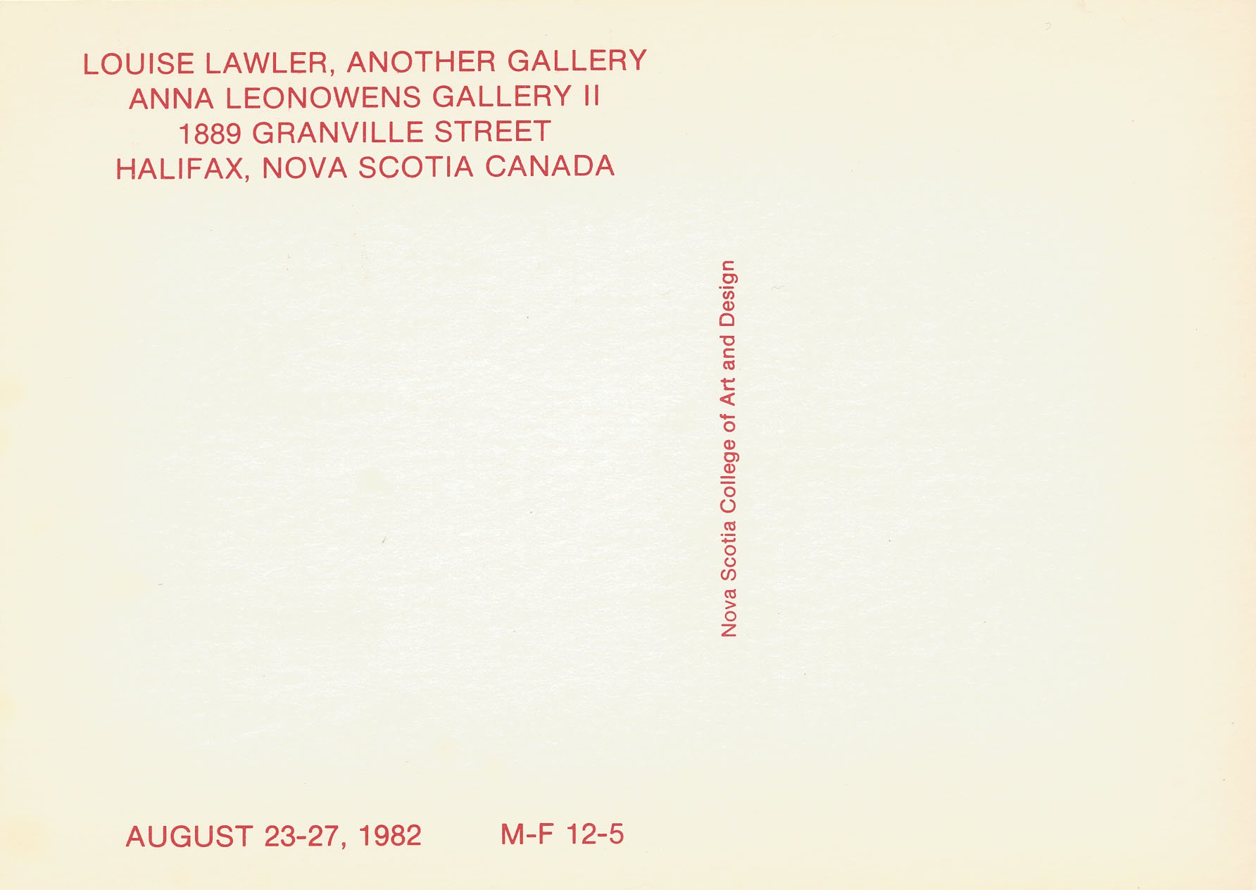
Announcement for Another Gallery, Anna Leonowens Gallery II, Halifax, 1982
Courtesy the artist
In 2017, against the backdrop of MAGA, Cambridge Analytica, “fake news” and her own survey exhibition at MoMA, Lawler began producing digitally distorted versions of her works with the moniker, “distorted for the times”. Conceived as digital interruptions to reflect social and political agita (and perhaps the artist’s own), these works circulated within and beyond the exhibition, in media representations and advertisements, confusing what could be known about the show and “pointing us” to the mediating lens of its own promotion.
Installation view:
Arranged by Donald Marron, Susan Brundage, Cheryl Bishop at Paine Webber, Inc., NYC (adjusted to fit), 1982/2016. Adhesive wall material. Dimensions variable to match proportions of a given wall at any scale determined by exhibitor.
Installed Museum of Modern Art, New York, Louise Lawler “WHY PICTURES NOW”, 2017
Advertisement for WHY PICTURES NOW, The New York Times, May 5, 2017
This “distorted for the times” strategy has grown from affecting representations of the works to producing new works in and of themselves. In these works, Lawler pivots from the framing and context of an image and moves into the image itself. Predominantly applied to previously existing works, what is being distorted is not only the objects pictured but a layer beyond - Lawler’s work itself. In this series, the artist is no longer an observer but an active participant in the manipulation of what is seen, what is known and conversely, what is blurred and withheld in the chain of viewer, object and layers of presentation. In producing new abstractions within existing images, Lawler continues her play in the potential of images; their ability to aesthetically seduce and coercively unnerve at any point in this chain of potential influences. Covering the gamut from comical (a Warhol and a Lichtenstein turned into kidney beans) to the “speechless” anxiety of extreme digital abstraction, Lawler’s “distorted for the times” series can leave us more uncertain than where we started. (Indeed, a familiar reflection of “the times” and its confusions.) Within this mirroring, however, what are we being asked to see?


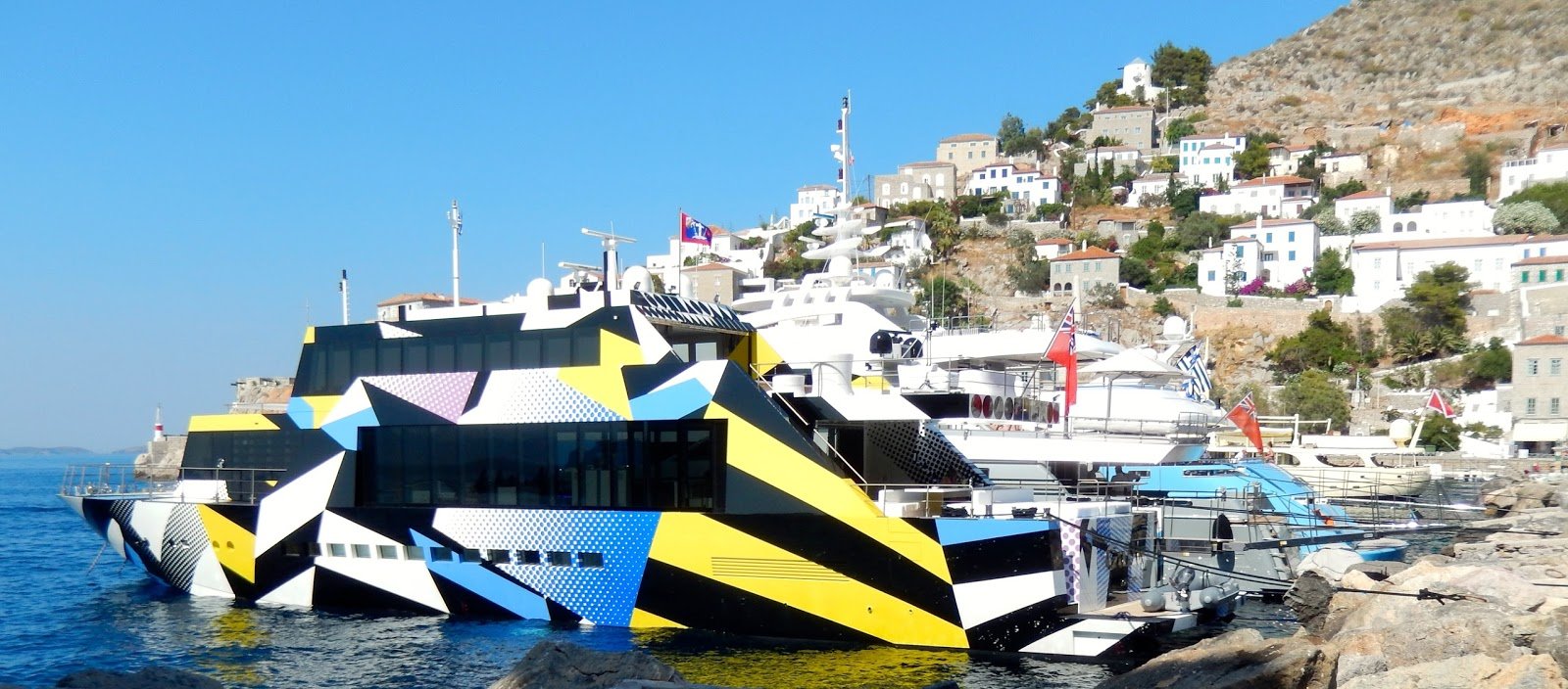
In World War I, the British developed a form of camouflage for navy vessels to evade detection by German boats. Known as “dazzle camouflage,” the goal was not to disappear but to confuse. Using irregular patterns in high contrast, dazzle camouflage was used to make it more difficult (from a great distance) to detect direction, speed and orientation. This patterning was used as inspiration by Jeff Koons in the creation of a 2013 mega-yacht, aptly named “Guilty.” (One can only assume the tongue-in-cheek allusion to the wealth being simultaneously announced and “disguised” in broad daylight.)


While Lawler is refreshingly not as announced as a striped navy boat, there is an agility in her strategies to obscure and withhold intentions and positioning, reminding us that images may always be playing a game. And for Lawler, there is always another hand to play. If images can show just as much as they can conceal, one must always be training to maintain advantage, including the distortion of one’s own works. If everything we see and know is mediated—even when we think we are seeing clearly—can we train our eyes to see not only what is being shown to us, but also the hand that is making us look? Can a distorting lens snap us out of complicity to see something differently? A favorite quote of Ludwig Wittgenstein, expounding on the hazy notion of knowing, comes to mind: “Is it even always an advantage to replace a picture that is not sharp by one that is? Isn’t one that isn’t sharp often just what we need?”
By hiding within her own images, Lawler reminds us to always try and see something new, including the distorting agendas of presentation itself.

Left: Soup (distorted for the times), 2022. Dye sublimation print on plywood. 9 x 6.5 inches
Available through KIPNZ.
Right: Squid In Its Own Ink, 1991. Louise Lawler. Wall graphic produced for the Carnegie International, Pittsburgh
All images courtesy the artist and Sprüth Magers. With thanks to Louise Lawler and Sprüth Magers.

Installation view. Three editions of “Soup (distorted for the times)” on view as part of “Modern Nature” at KIPNZ, 2022.